
The Eurovision Song Contest is looking to the future with a brand-new visual identity as it prepares to celebrate its 70th anniversary in 2026.
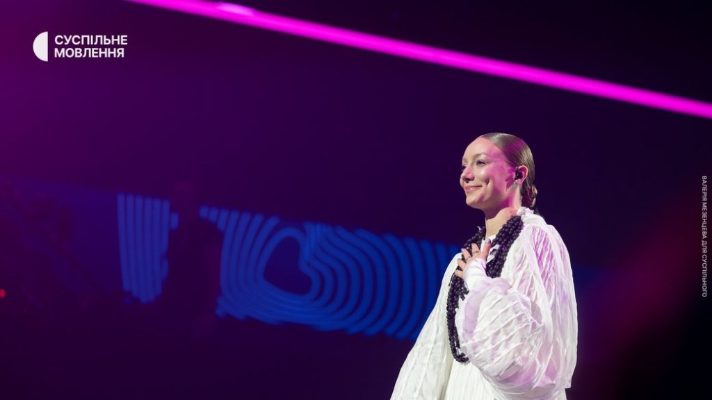
Earlier today, the EBU revealed a refreshed logo and a new 3D “Chameleon Heart” that will serve as the centrepiece of the Contest’s branding moving forward. The update replaces the iconic hand-drawn script logo that has been synonymous with Eurovision since 2004, and which was subtly modernised in 2014.
According to organisers, the rebrand is designed to reflect the evolution of the Contest and to make the logo more versatile across digital platforms. A special “70th Heart” was also introduced to mark the anniversary year, made up of 70 layers to symbolise each edition of the competition.
“The Eurovision Song Contest has always been about evolution – musical, cultural, and creative. This refresh honours 70 amazing years while taking the brand forward to an exciting future. It’s bold, playful, and full of heart – just like the Contest itself.”
Martin Green CBE, Director of the Eurovision Song Contest
He added that the updated branding will help unify Eurovision’s many projects and ensure consistency as the competition continues to grow internationally.
But if the EBU hoped fans would embrace the change, early reactions suggest the new look has some work to do to win people over. The official Eurovision Instagram post celebrating the reveal quickly filled with critical comments.
@thebalkanguyyy
“There are so many problems with Eurovision but the logo is NOT one. The old one was MUCH BETTER, why try to fix something that ain’t broken?”
@m.dalgobbo
“CHANGE IT BACK WE’RE NOT ON DISNEY CHANNEL IT’S NOT A CHILD CONTEST”
@canaltuglu
“I’m open to change, but this doesn’t feel mature at all. It’s giving Junior ESC vibes. It really misses the mark.”
Others mocked the style, with @jesc_chair quipping: “This is giving Canva / AI and not in a good way .”
Even the more understated comments conveyed disappointment: “This ain’t it, folks,” sighed @eurovangelists, while @benngarner90 simply asked: “But why?”
The Eurovision logo has not changed often. The now-retired hand-drawn script debuted in Istanbul in 2004, a bold step away from the generic branding of earlier years. It was updated in 2014 ahead of Copenhagen, where the heart symbol inside the “v” was sharpened and modernised. For over two decades, it became instantly recognisable worldwide and often adapted to reflect the flag of the host nation.
With the introduction of the Chameleon Heart, the EBU hopes to replicate that adaptability while creating a stronger standalone symbol that can live beyond the wordmark. The new heart is intended to “absorb cultural influences, music and movement,” according to organisers.
The rebrand comes as preparations begin for the milestone 70th Contest, which will be held in Austria thanks to JJ’s dramatic victory in Basel earlier this year with “Wasted Love.” It will be Austria’s third time hosting and their second anniversary edition, following Vienna 2015.
Fans will start seeing the new look rolled out across Eurovision platforms and events in the months leading up to May 2026. The EBU has also promised “more surprises” as part of its year-long celebration of seven decades of being “United by Music.”
Whether the updated identity will eventually grow on the fan community remains to be seen. But if the reaction so far is any indication, the Eurovision heart may be beating louder than ever – just not in the way organisers intended.
Let us know in the comments or on social media if you love or hate the new nogo. Follow our social media profiles @buildingbridgespod as we’ll be updating you on the road to Austria 2026!
Photo: EBU / Eurovision.tv


Leave a comment